
A closer look ↘
The brief was simple: give body and hand care a language of its own. Something clear enough to understand at a glance, and warm enough to live with every day.
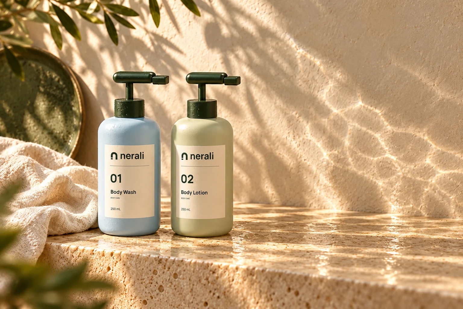
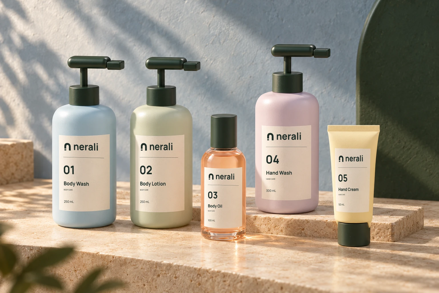
The concept begins with an open arch. A small mark that repeats across five colours and four container formats. Numbers identify the family; names tell you what each object is.
The execution connects pale blue, leaf green, apricot, lilac and yellow with cream labels and deep green details. The website extends that system into photography, type and movement.
The documented result is a five-product design collection, the Daily Duo, packaging artwork and an interactive digital experience. Product testing, manufacturing and customer outcomes are not yet available.
Explore the story’s collection